Saturday 2 July 2011

Watercolor Sketch Technique

This Tutorial was created using Adobe Photoshop CS5 on a Mac
Apply the Sketch Filter
  • Duplicate the Background photo layer. 
  • Set Color Chips to black and white.  Choose Filter>Sketch>Photocopy.
  • Adjust the Photocopy settings for the photo.  I used 5 detail and 50 darkness. Choose Layer>New Fill Layer>Solid Color.  Click OK then use the Color Picker to choose white.
Mask Out Distracting Details
  • Click on the sketch layer in the Layers palette.
  • Click on the Add Layer Mask icon at the bottom of the Layers palette
  • With the foreground color set to black, select a hard brush and set both the opacity and the flow to 100%.
  • Click on the layer mask thumbnail of the sketch layer and click OK.  Brush away distracting details adjusting the size of the brush as needed.
  • Choose apply layer mask.
Make a Transparent Overlay
  • Hide the visibility of the Background photo layer and the Color Fill Layer.
  • Click on the sketch layer in the Layers palette.
  • Choose Select>Color Range and use the Color Picker to select the white area of the sketch.  Adjust the fuzziness and click OK.  Press the delete key to remove the white areas.  Deselect.  Now you have a sketch with a transparent background.
Painting Image
  • At this point you may choose to extract the image, as shown in this example, if you do not want to include the background.  If so, duplicate the Background photo layer and hide the original layer.
  • Select the duplicated Background photo layer and extract image. Choose Filter>Brush>Strokes>Sumi-e and adjust the Stroke Width, Pressure and Contrast.  For this example the Stroke Width is 5, Stroke Pressure is 4 and Contrast is 2.
  • Now comes the fun part.  Select a watercolor brush, set the opacity around 50% and add a layer above the duplicated photo layer.  Use the Color Picker to select colors from the image and begin painting over the photo.  Add a new layer with each new color selected, changing the size of the brush and the opacity as you paint.  Try using bold strokes and paint beyond the lines to give a more realistic appearance of a watercolor painting.  In this example, the background was added on its own layer below the duplicated Background photo layer.
  • Merge all layers and save as a png file.  And here is the finished layout.  As you can see, I could not resist adding a Colts cap.


Tuesday 17 May 2011

It's all in the Details

 Tutorial created using Adobe Photoshop CS5 on a Mac
Creating a believable shadow can make all of the difference in a digital page.  So here's a little tip.
  • On the example shown above I have wound the string around the dotted ribbon by holding down the control key (command on a Mac) while clicking inside the thumbnail of the string layer in the layers palette.  This will create marching ants around the string.  
  • Next click on the ribbon layer and erase just the area where the string covers the ribbon.  Press control D (command) to release the marching ants.  
  • To create a shadow, duplicate the string layer.  Click on the thumbnail of the duplicated string layer and press control (command) to create marching ants. Go to Edit>Fill>Black.  Now place the layer underneath the original string layer. 
  • Then go to Filter>Blur>Gaussian Blur (just enough to soften the edges, around 2-3 pixels) and  change the opacity of the shadow layer to around 40-50%.  Notice that the entire shadow will fall underneath the ribbon.  
  • To make the shadow more realistic,  draw your marquee tool around the shadow that is beneath the ribbon.  
  • Cut and Paste and move the shadow layer above the ribbon.  You will need to reset the Blur and the Opacity.  
  • If you have the warp tool with your software program, this is an excellent spot to do some pushing and pulling to manipulate the shadow.  Keep in mind that a little extra effort will give great results! 

Product used is Pebble Jones'_Wild Safari,  Brandy Murry's_Alpha Strings and Curled Up.

Saturday 30 April 2011

Two more fantastic Photo Templates by Catherine of Butterflies and Bluebells.  I think that the blending adds such a professional touch.  They may be purchased HERE.  I completed the layout below in about 15 minutes.  The time consuming part was simply choosing which photos to use!  Just click on the layout for a larger image.  The sunsets were incredible.


How to Make Froggies


Choose an object that has a subtle difference in coloring.  This frog is from a Collection called Cabana by Sheri Johnson.   
This is how I made the frogs that you see in the layout above.  Using Select>Color Range, set the Fussiness to around 74.  Then use the eye dropper to select a color somewhere close to the edge of the frog to achieve a soft outline.  
 By selecting the middle of the frog, I was able to capture more of the image.
Once selected the marching ants will appear, copy and past onto your layout.
I applied a glossy style to the solid frog, whereas I simply used Hue/Saturation>Colorize on the outlined frog.  Products used are from Brandy Murry's Grandparents, Back Porch, SS_Emb_Laurels, SS_EMB_Paper Roses, Sheri Johnson's Cabana and Angela Blanchard's Waters Edge.

Monday 28 March 2011

How to Create a Painting from a Photo

I am using Adobe Photoshop CS3.  Click on examples to enlarge.  Copy photo to new document.  Go to Filter>Distort>Diffuse Glow and adjust arrows to give a glowing contrast.  Next go to  Image>Levels and adjust the middle arrow to give even more contrast.  If a softer look is desired go to Filter>Blur>Glaussian Blur and apply a touch of blur.  (My photos are usually blurry without any help!)

Select a mask that has soft edges and clip to photo.  Merge the two layers together.  Use a very soft brush and lower the opacity to erase around the edges and soften even further.  At this point you may want to duplicate the page and set it aside should you want to start over after applying the next step.  Choose a grunge type brush and carefully erase into the photo adjusting the opacity accordingly.   Be careful not to get too carried away.  

Choose a antique, splotchy background paper and place on layer below photo.  Go to Layer>New Adjustment Layer>Selective Color and check box that reads Use Previous Layer to Create Clipping Mask.  You will now be able to adjust the reds, yellows, etc. to blend with the hue of your paper.  As you can see, Nicholas’ skin tone needed more yellow and I adjusted the cyan slightly.  I did touch up his cheek on the original layout but I left this example as is.  He had been bitten on the cheek at school by his best friend on the previous day.  I think it hurt me more than it did him!  Now you are ready to flatten layers, print and frame.

Products used:  
Thao Cosgrove_Lifes Canvas Paper
Brandy Vanenzuela_BrushSet_Worn Threads
Brandy Murry_BrushSet_Junk Trunk
Erica Hite_Brush_Set_Chalkboard Fill
Inspiration from layout designed by Shalae Tippets

Thursday 24 March 2011

This is the third set of Photo Templates designed by Butterflies & Bluebells.  I had never used templates until Catherine made these lovely sets available.  To my pleasant surprise, I am hooked.  I can put a page together in less than 10 minutes and feel so very accomplished.  I love the simplicity of the design therefore putting the emphasis on the photographs themselves.  There is just enough space allowed for the title and journaling to add a little more interest to the page.  The Decor Templates each have different masks that are gorgeous.  Try them. You will love them. . and they are on sale until April 13.


Friday 11 March 2011

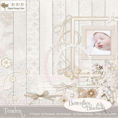
Catherine's (Butterflies and Bluebells) latest Collection, Tender, includes all one would need to design a knock-out page.  Although it is monochromatic, it is filled with scrumptious textures and versatile elements that would adapt to a number of themes. 

Here's our little heavenly gift, Nathan.
And Catherine's 5 week old precious Nicolas, who surely must have inspired this Collection!
 This lovely frame with cluster is FREE.